Creative Brief
Background
Narcisses Spa wanted a new brand identity that will distinguish it as the leading spa in Western Bronx. The brand identity program included a logo, stationery (letterhead and business card), information booklets, outdoor signage, lobby sign, a Facebook page and a full website.
Audience
Narcisses Spa serves Latino women, primarily from the Dominican Republic, between the ages of 25 and 40. The audience is bilingual in Spanish and English, own businesses, are college educated professional, or financially-stable stay-at-home mothers. For these women beauty is very important. It’s important to reassure the audience that the spa will help them attain their ideal beauty, particularly anti-aging, weight-loss and anti-cellulite treatments.
Objectives
The client’s objective was to help its target audience find answers to all their beauty needs through individualized services. The objective of this project is to create a brand identity that evokes youthfulness, relaxation and expertise.
Message
Tagline: For all your beauty needs.
Narcisses Spa always offers a free consultation to give the client an opportunity to speak about her beauty problems. Narcisses Spa develops individualized plans for every client and carefully monitors her progress. Narcisses Spa offers treatments for beauty problems that people believe don’t have solution: cellulite treatment, varicose veins, aging, warts, etc. Narcisses Spa uses state-of-the-art technology and dermatologic products in all its services.
Market Research
The competition uses a muted color palette with various shades of colored neutrals or greys. Narcisses Spa brand will use a quiet color palette to communicate serenity, calmness and relaxation. Narcisses Spa offers a number of highly-sought services that the competition does not. The website and information will be crucial for communicating these services to the target audience.
Approach
Historical Visual Research
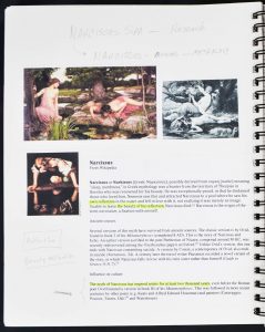
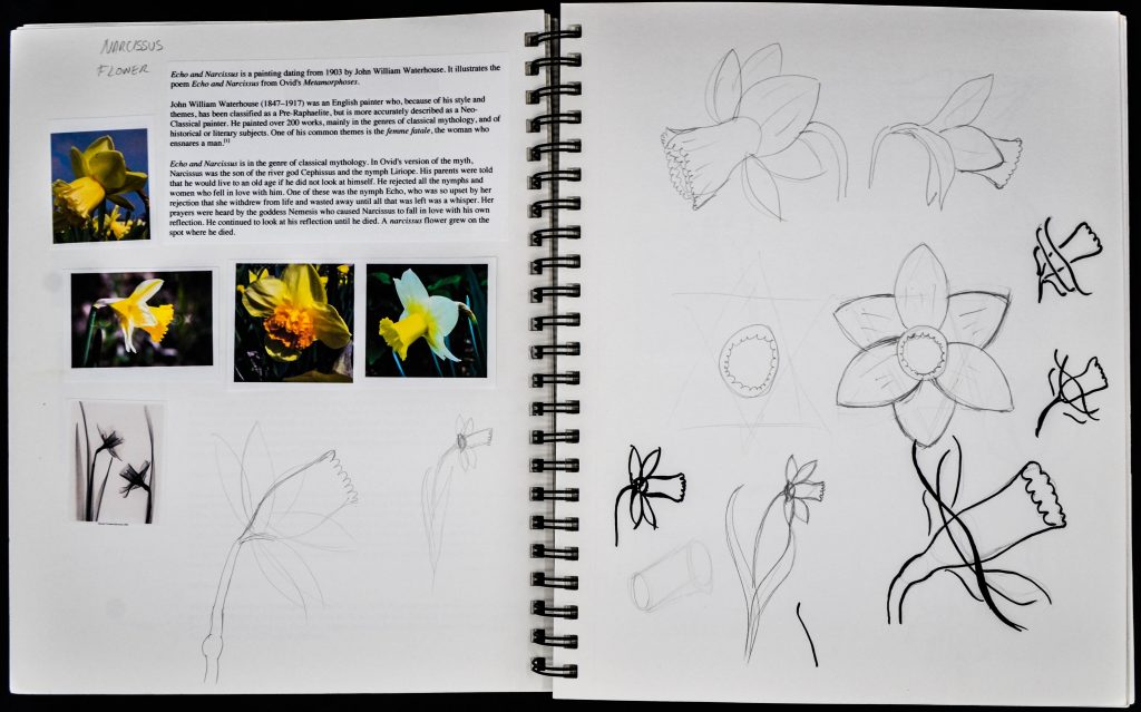
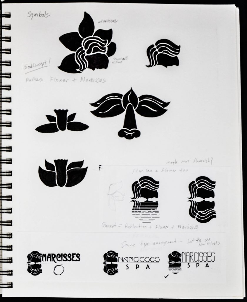
I started the project by researching visual representations of Narcissus, the mythological Greek character who was tempted by Nemesis to fall in love with his own reflection, and dies looking at his own image. Narcissus is the flower that was born at the place of his death. The visual representations discovered through the research phase provided a starting point for developing the logo mark of Narcisses Spa.
Narcissus in Greek Mythology and Pre-Raphaelite Art
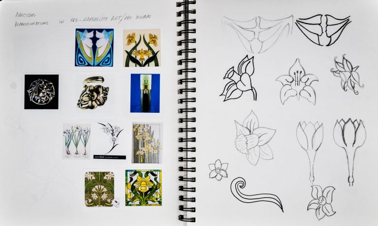
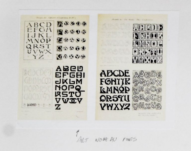
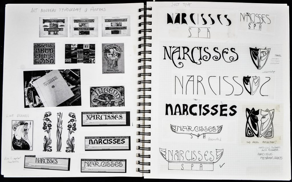
In surveying the period of pre-Raphaelite art, I found several paintings of Narcissus looking at his beautiful reflection in water. The concept of reflection resurfaces in the Art Nouveau period, where decorative presentations of the narcissus flower abounded. One characteristic of these representations was the use of symmetry to show the image of two narcissus flowers as a reflection of one another, a reference to Narcissus looking at himself in the water. The typography of the art nouveau were characterized by intricate and elaborates forms. From this research I chose the flower, reflection and Art Nouveau typography as the driving concepts for the identity of Narcisses Spa.
Natural Representation Exploration
The image shows my process for getting familiar with the natural shape of the Narcissus flower through drawing exercises.
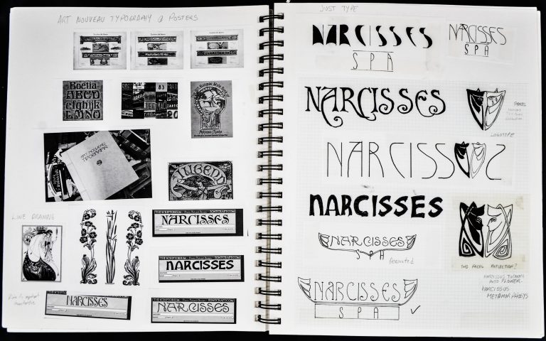
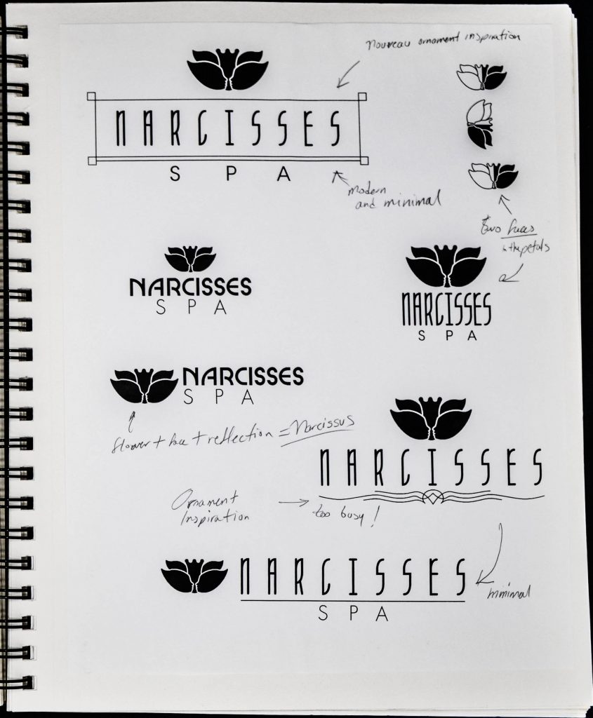
Typographic Explorations
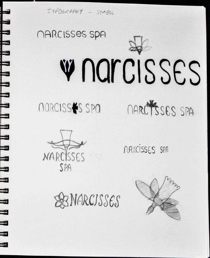
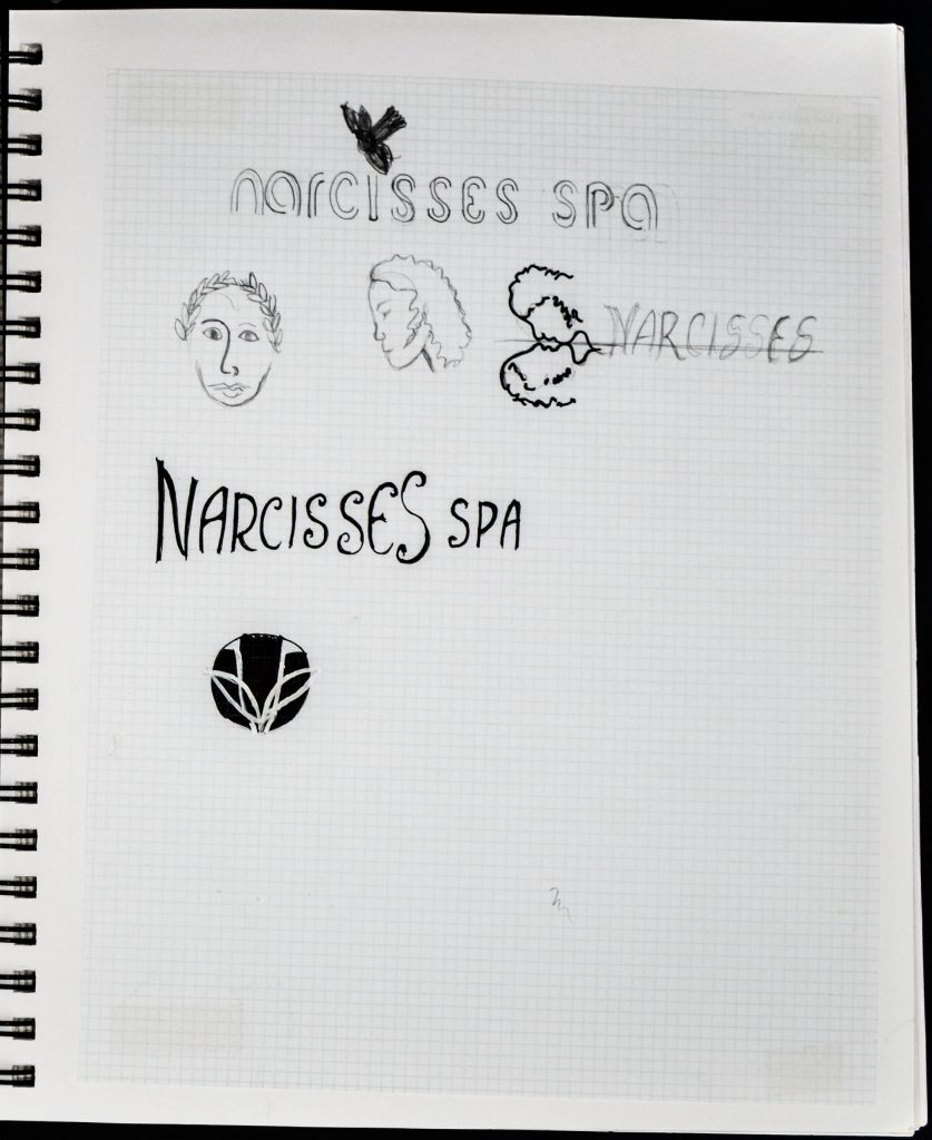
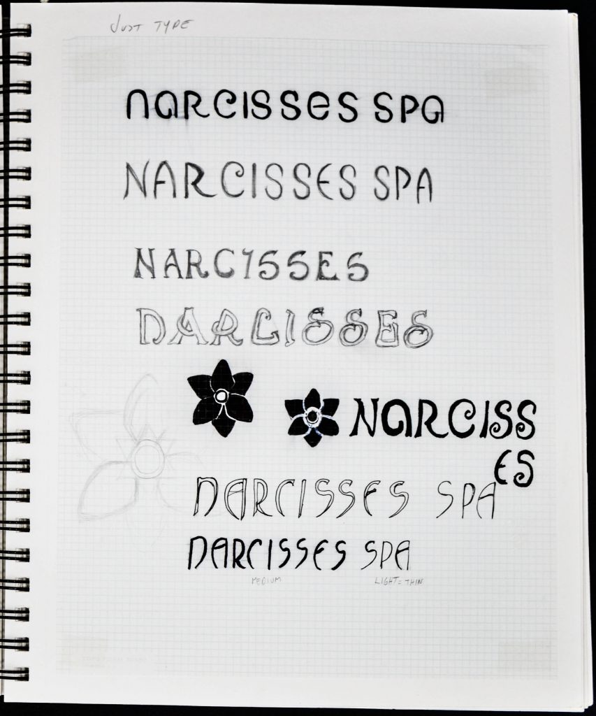
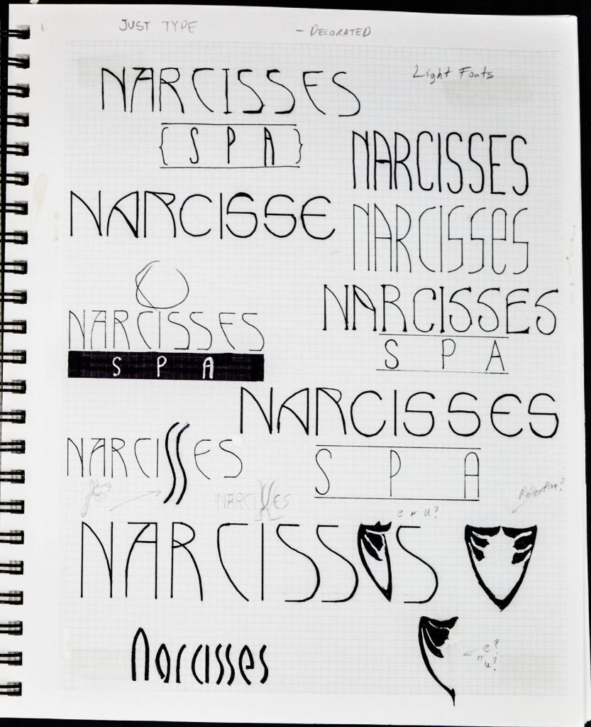
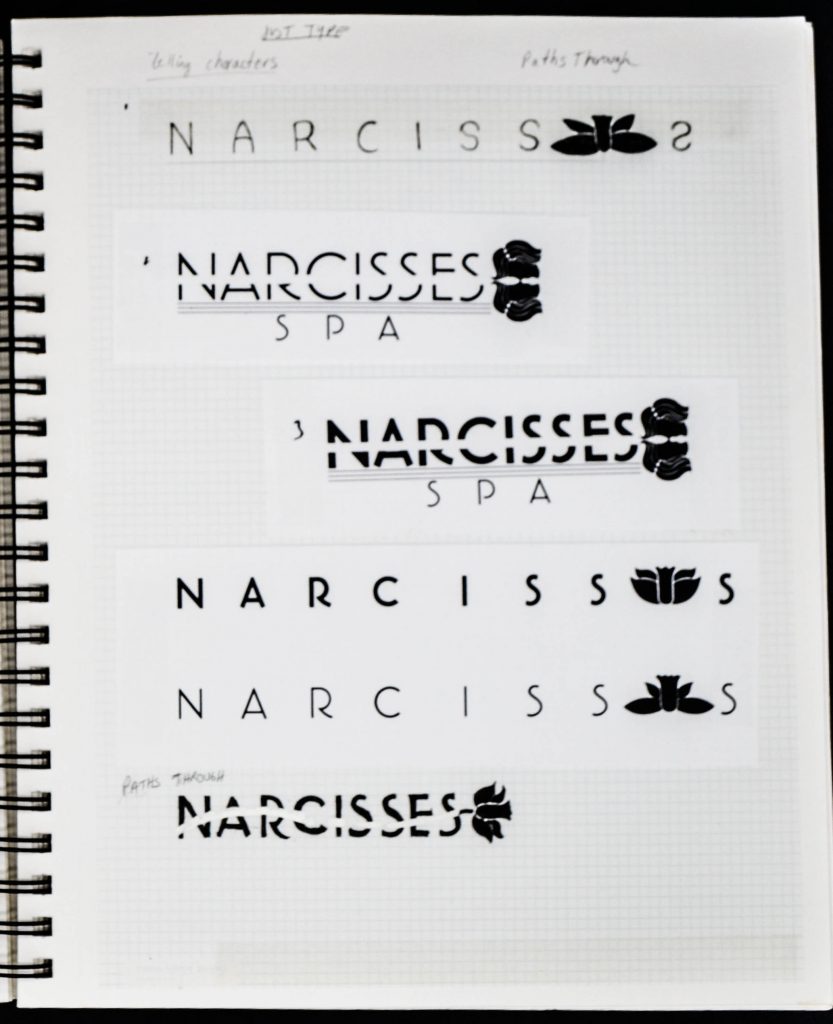
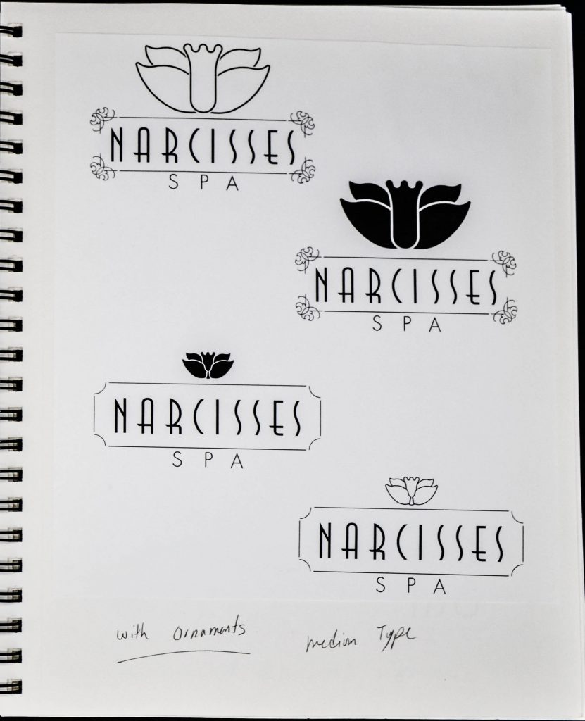
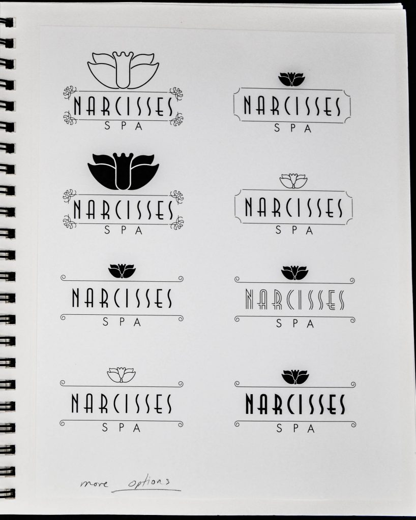
In my process of defining the visual identity of a brand, I explore the development of the typography and logotype simultaneously. The images above show several hand-drawn and digital iterations of type treatment and logo mark.
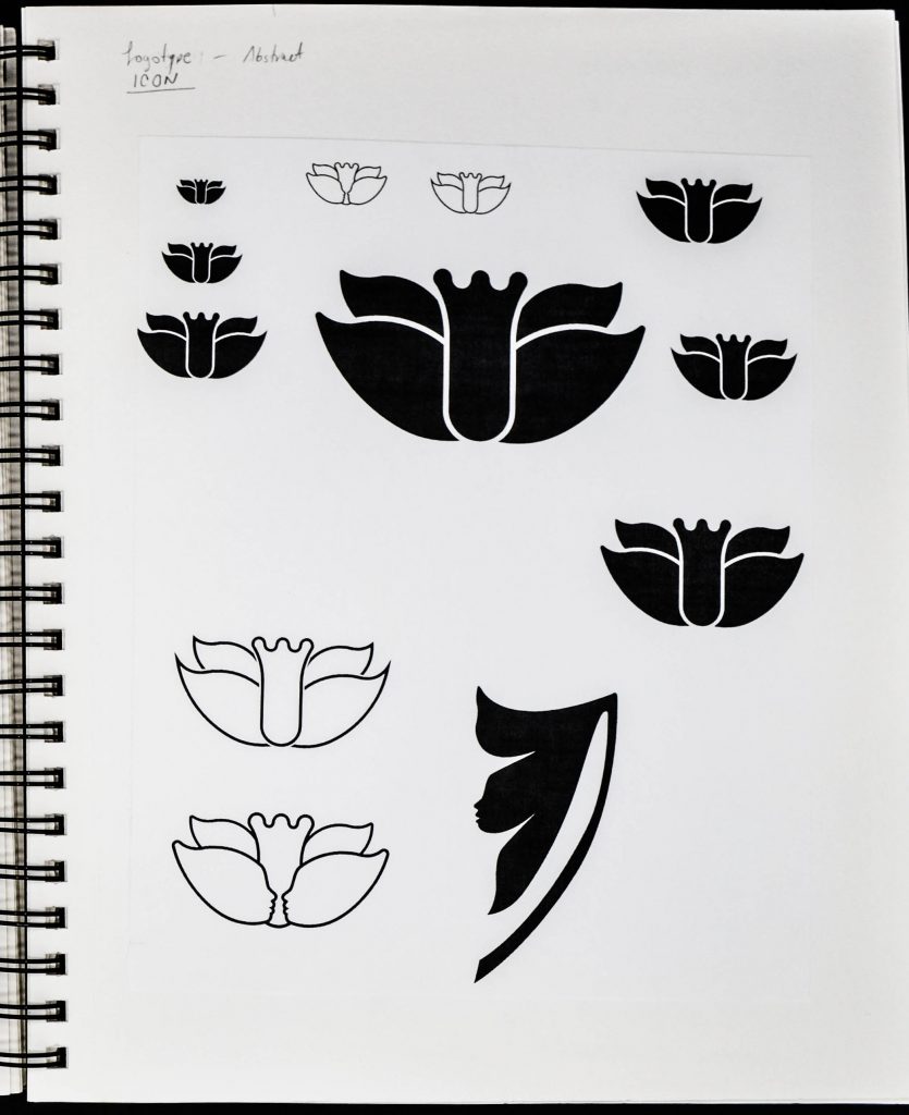
Symbol Explorations
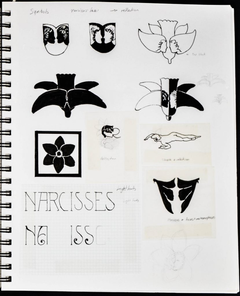
After several iterations, the client and I agreed on a final direction for the logo mark, to be further refined.
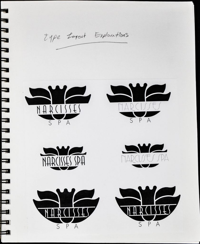
Layout Exploration
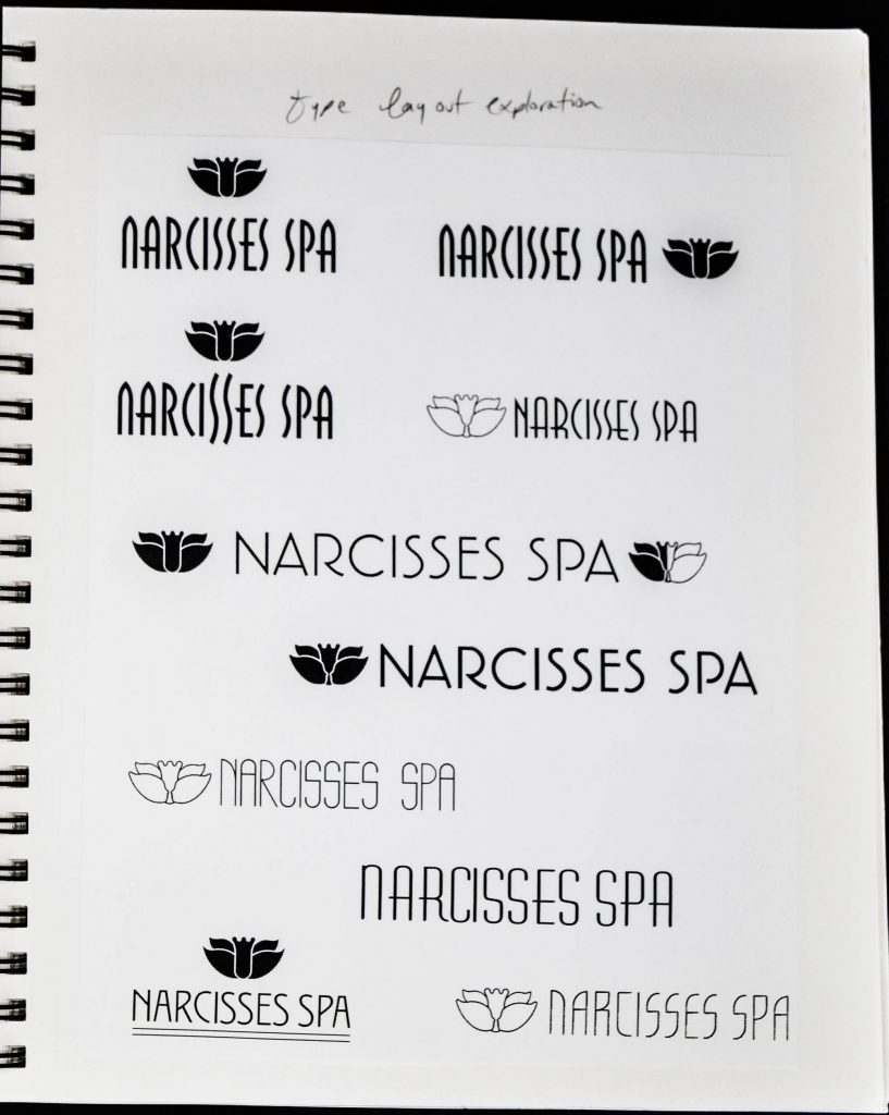
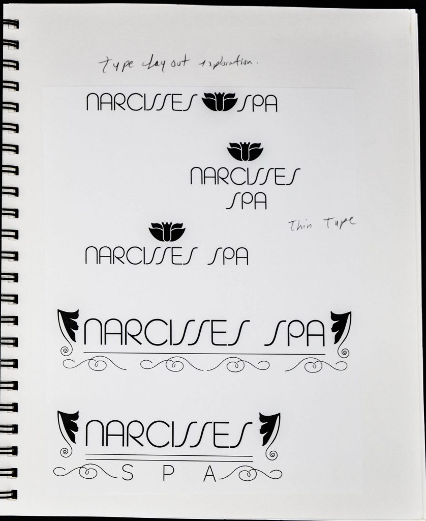
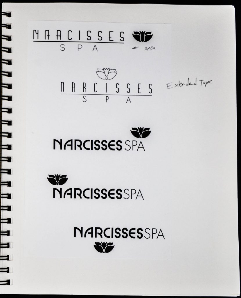
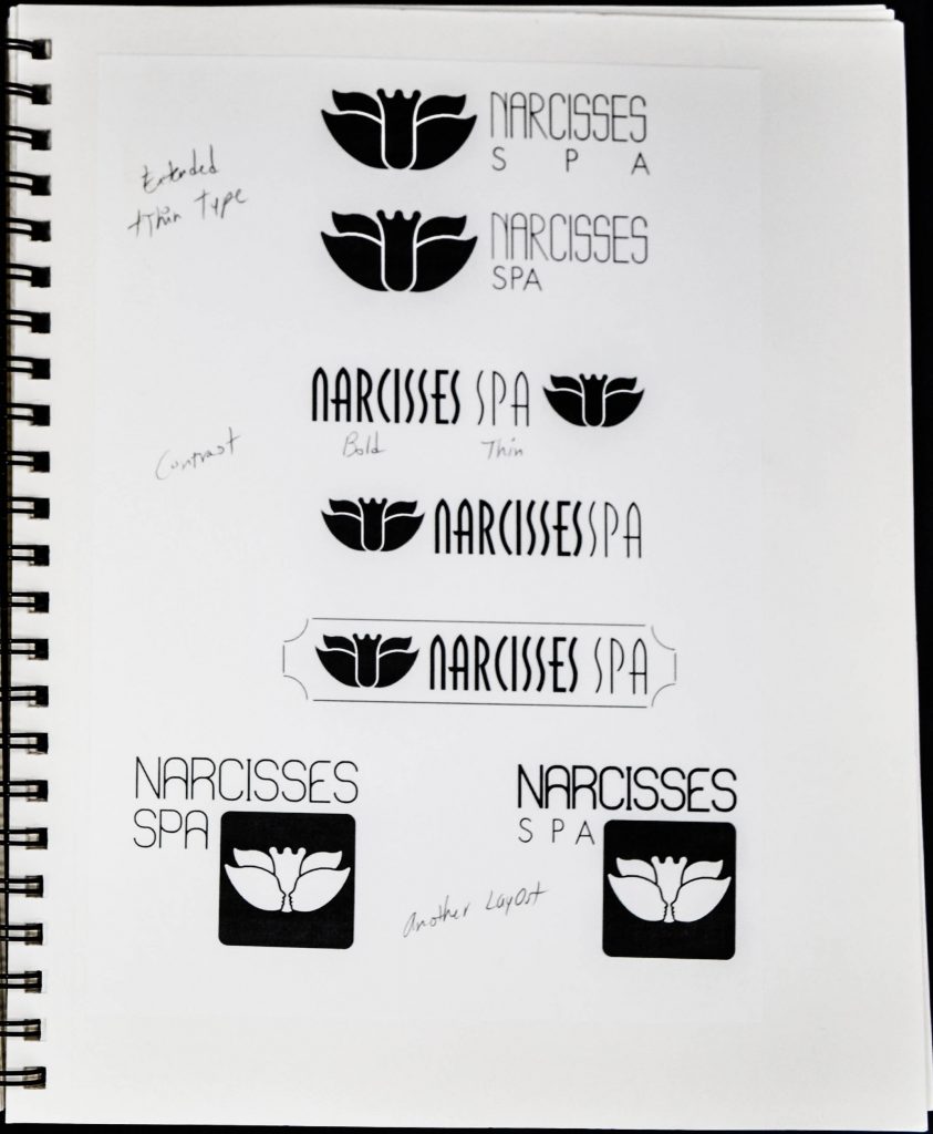
Then I explore layouts combining logo mark and type.
Refinement
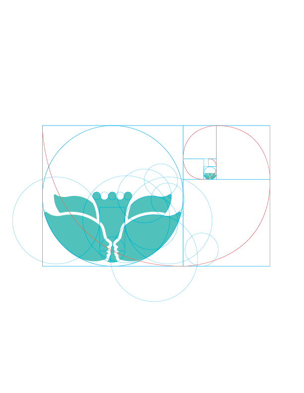
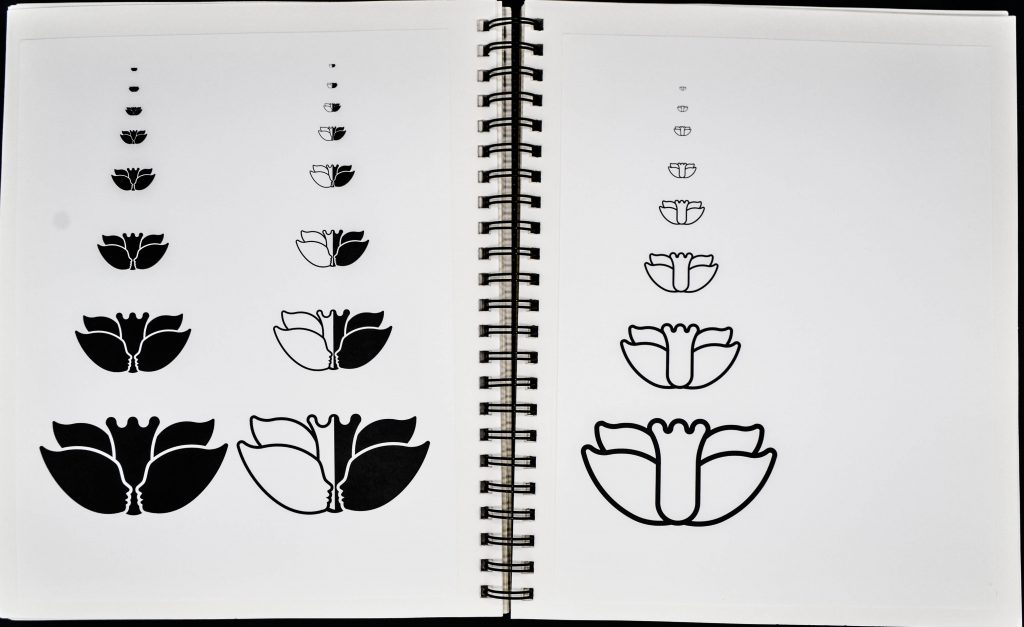
Then I used the golden mean as a device to refine the proportions of the logo mark, and test the outcome at various scales to ensure legibility at different sizes.
Color Exploration
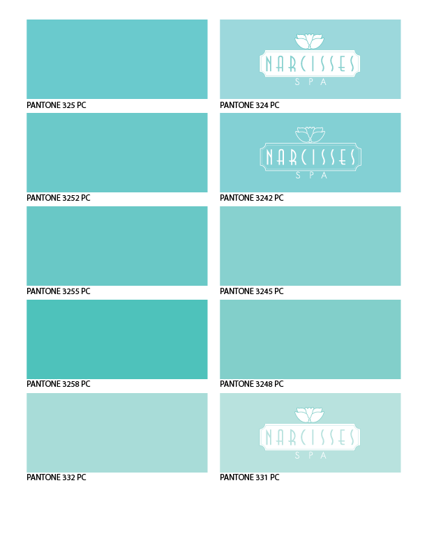
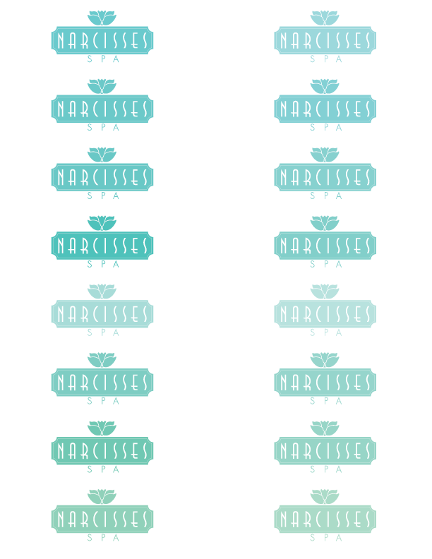
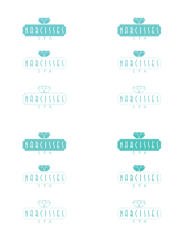
Through various color explorations, the client and I agreed on a final palette which communicates serenity, calmness and relaxation.
Final Logo Design
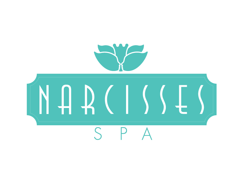
This is the final logo. The final logo is modular, giving the client the opportunity to interchange the word spa to apply to other lines of products and services. For example, the word spa could be replaced for soaps, facials, etc.
Stationery
As a part of the program I presented several options for stationary, including business cards, letterhead and brochures.
Website
For details of the website design, please see here.

