Educational Opportunities Initiative
(Case Study)
Project: Educational Opportunities Initiative
Client: The Jaime Lucero Mexican Studies Institute
Role: Graphic Designer
WHAT THE CLIENT NEEDED:
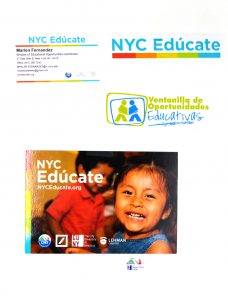
Since 2012, the Window of Educational Opportunities (WEO) program of the Jaime Lucero Mexican Studies Institute (JLMSI) at Lehman College has been helping bilingual families become educated about educational opportunities available in NYC to people of all ages. WEO sought a redesign of its logo and the development of collateral material in order to strengthen its institutional identity.
WHAT I DELIVERED:
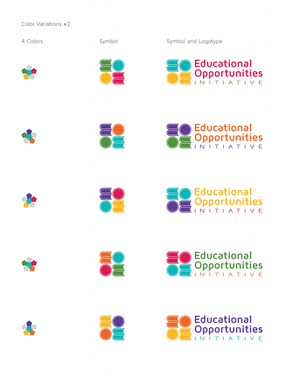
2) A strong, stand-alone, mark capable of supporting WEO’s expansion.
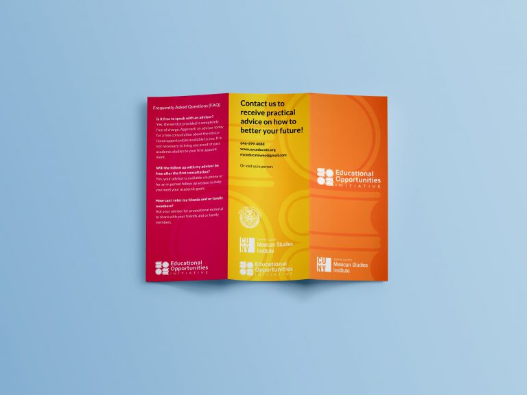
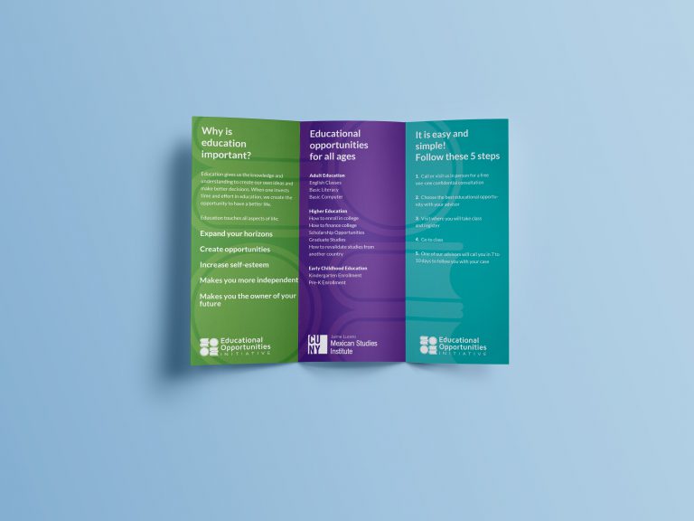
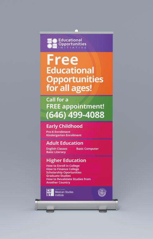
3) A brochure and banner designed according to WEO’s new brand identity.
Approach
Research and Early Explorations
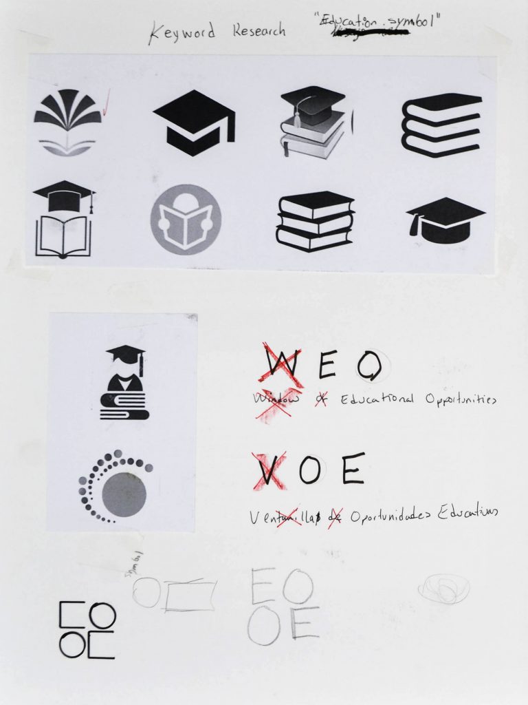
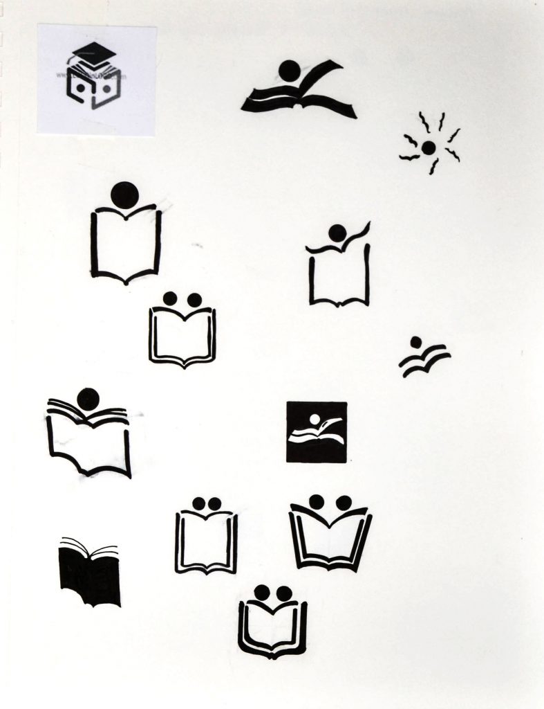
I began by researching symbols associated with the keywords Education and Opportunities. The image on the left shows a few symbols used to represent Education.
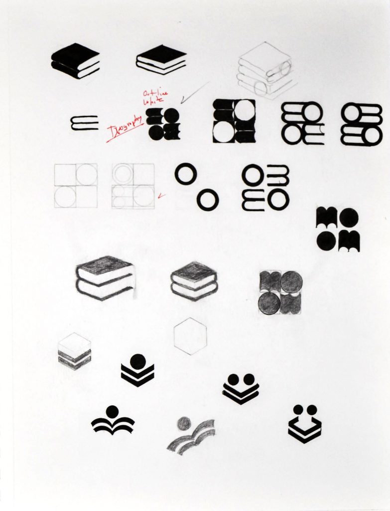
Through the Educate initiative, the JLMSI wanted to reach Spanish and English-speaking audiences. The challenge was to find a symbol that would work for both audiences. As a first step towards achieving this goal, the client agreed to drop the “W” from Window of Educational Opportunities and the “V” from Ventanilla de Oportunidades Educativas, leaving the interchangeable letterforms “EO” for Educational Opportunities and “OE” for Oportunidades Educativas.
Symbol Exploration
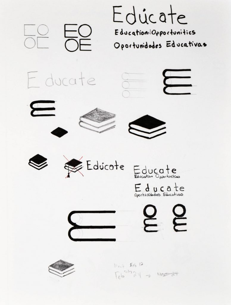
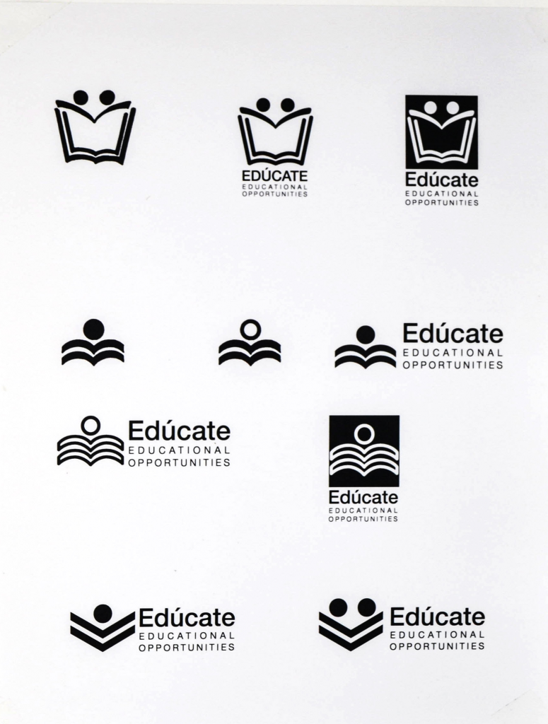
I then began to explore abstracting the shape of a book into the letterform E of “Education”, and the shape of a human head into the letterform O of “Opportunity.”
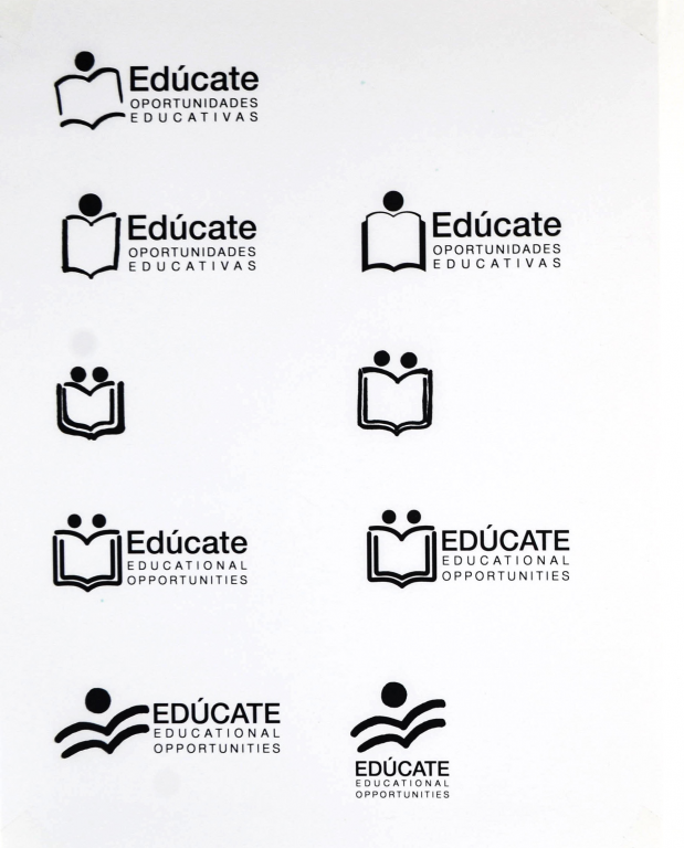
Type Layout Exploration
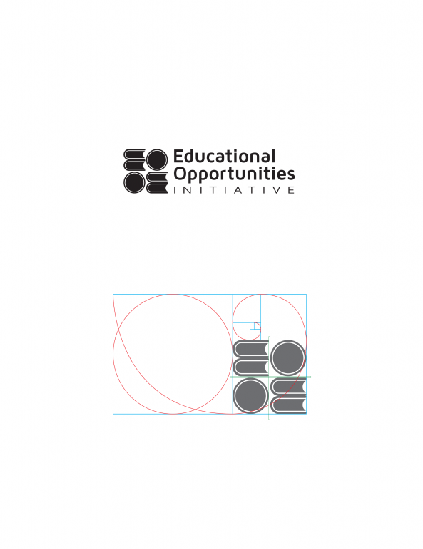
Examples of symbol and type layout explorations in digital form.
Logo Guidelines
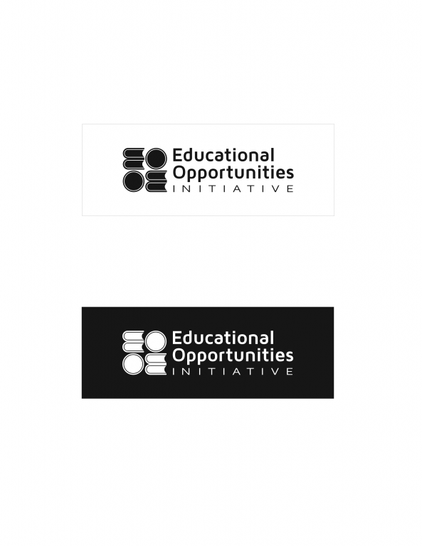
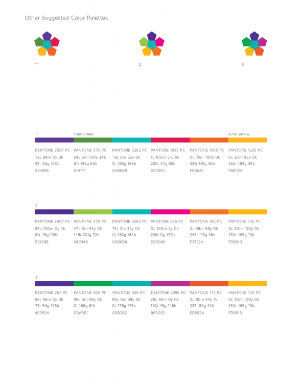
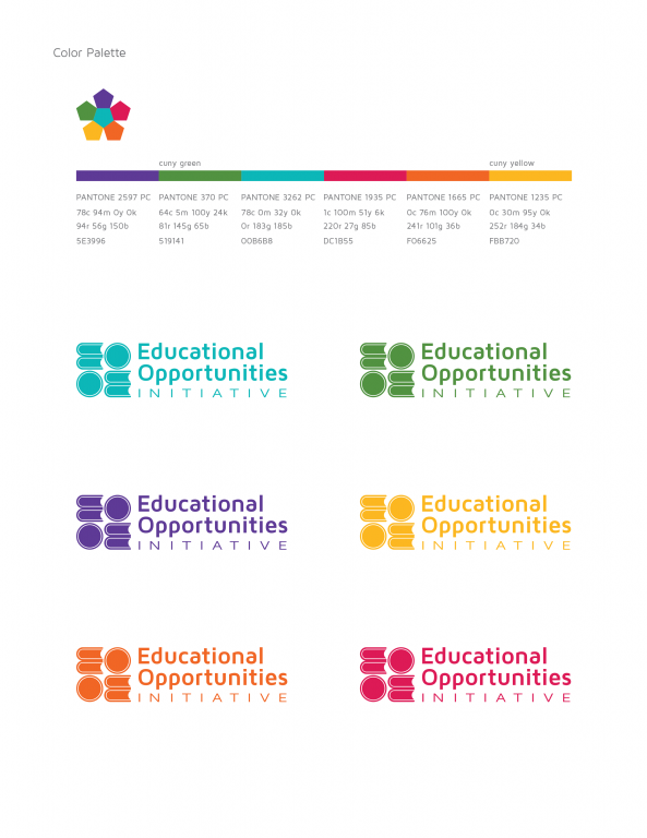
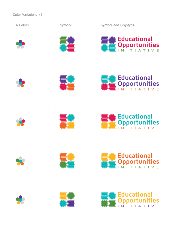
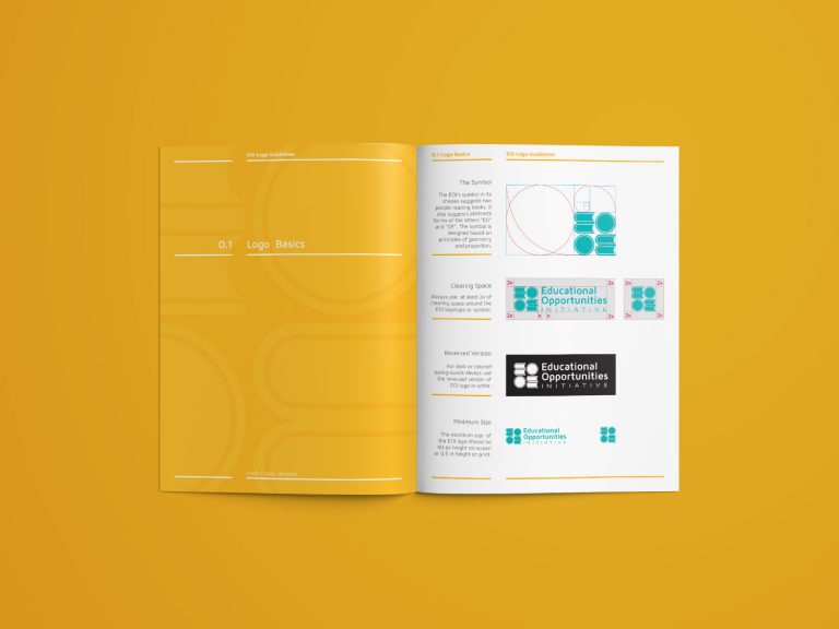
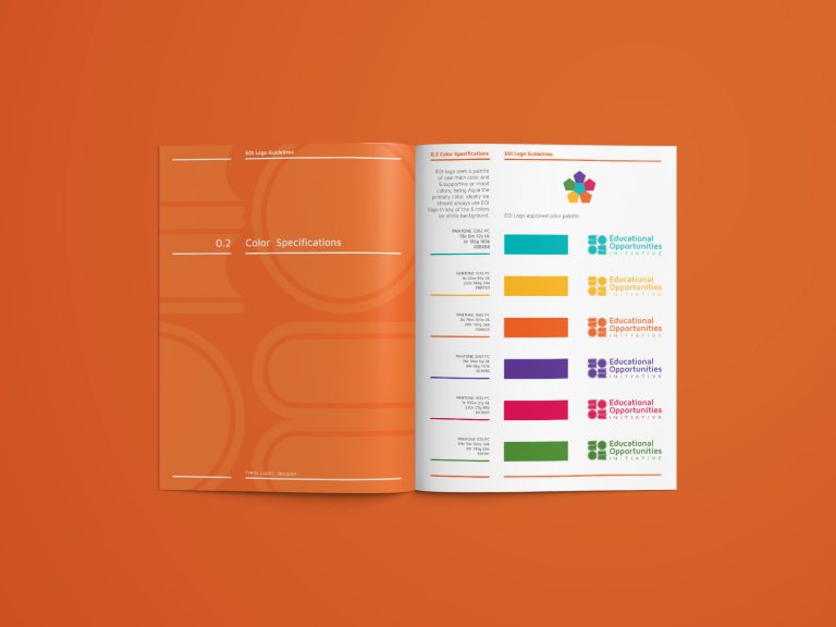
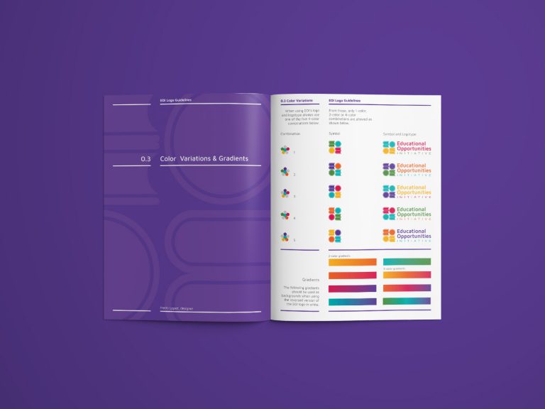
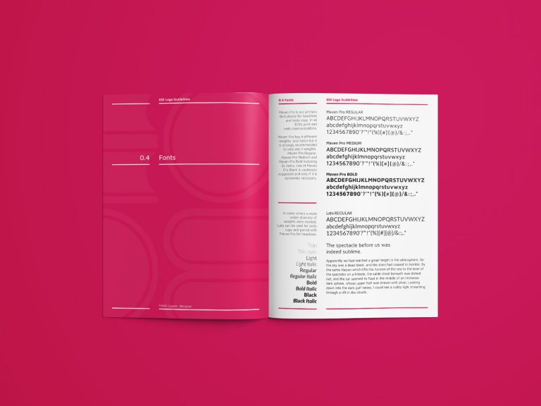
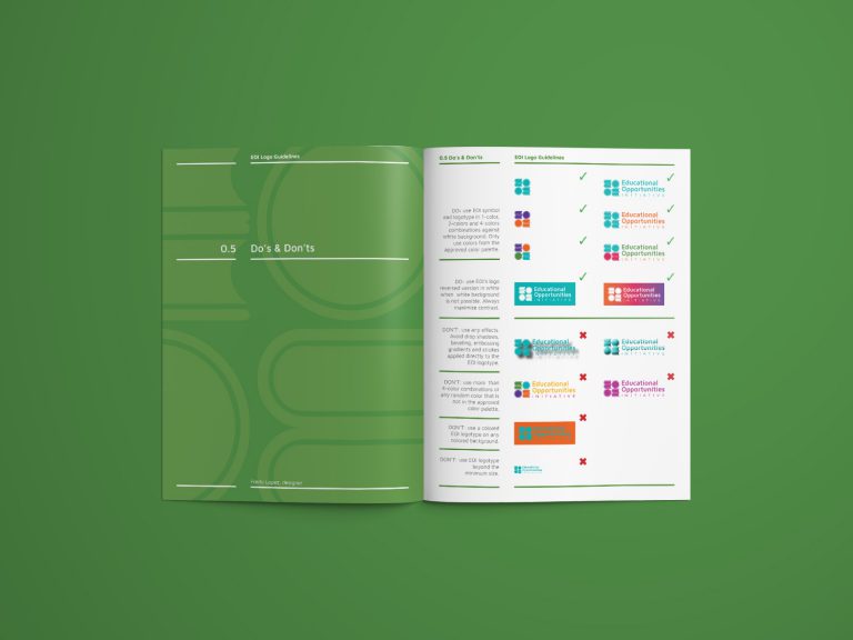
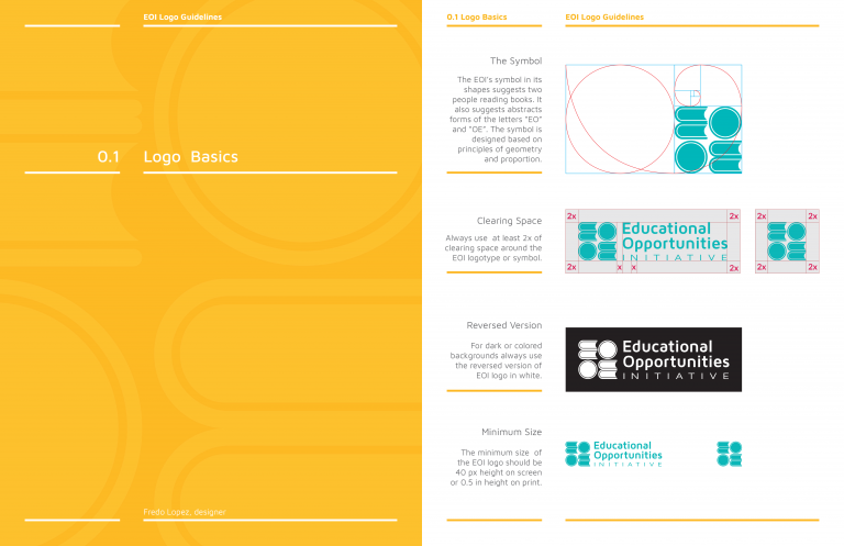
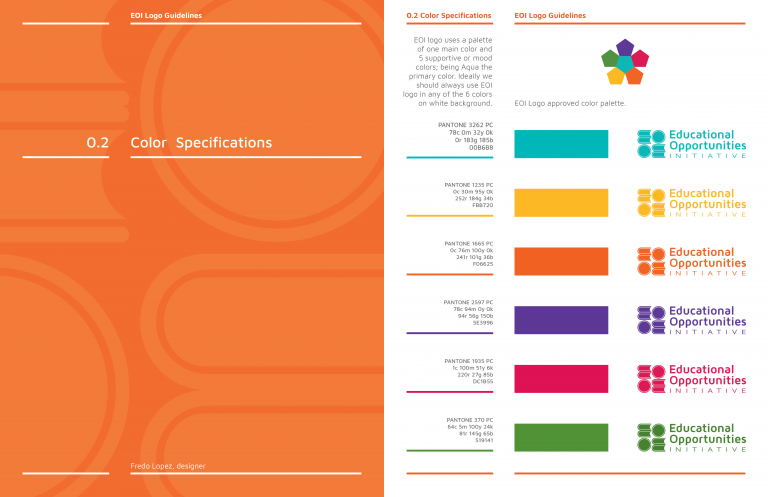
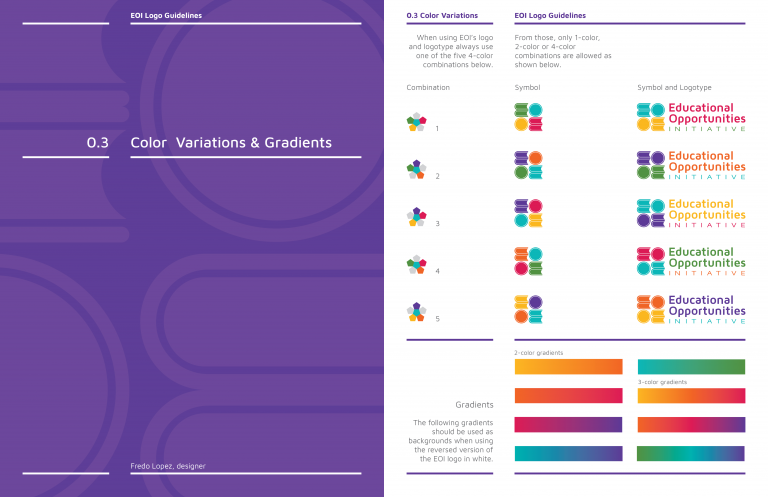
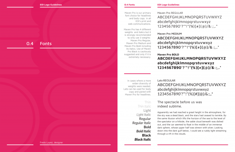
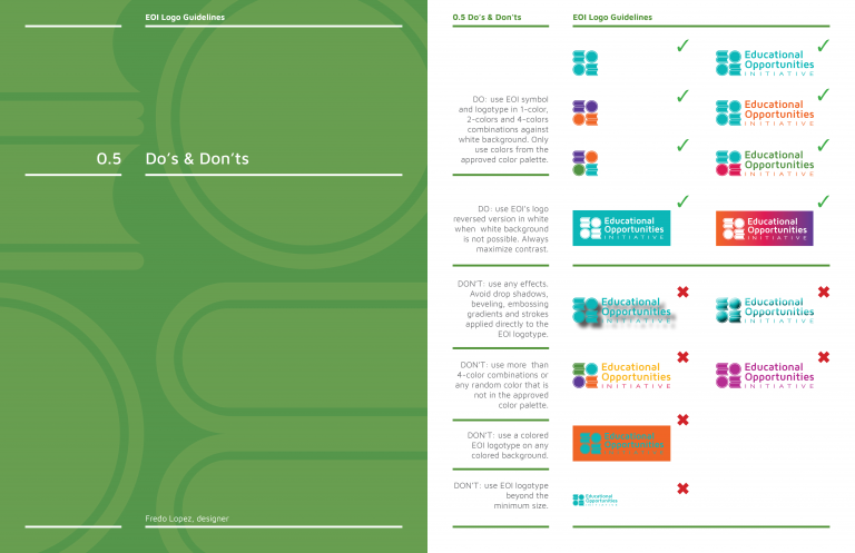
Logo Guidelines were produced to help the client maintain branding consistency across different media.
Brochure and banner
You might be interested on these projects:
Or browse more of my work in the Projects archive or visual journal.
